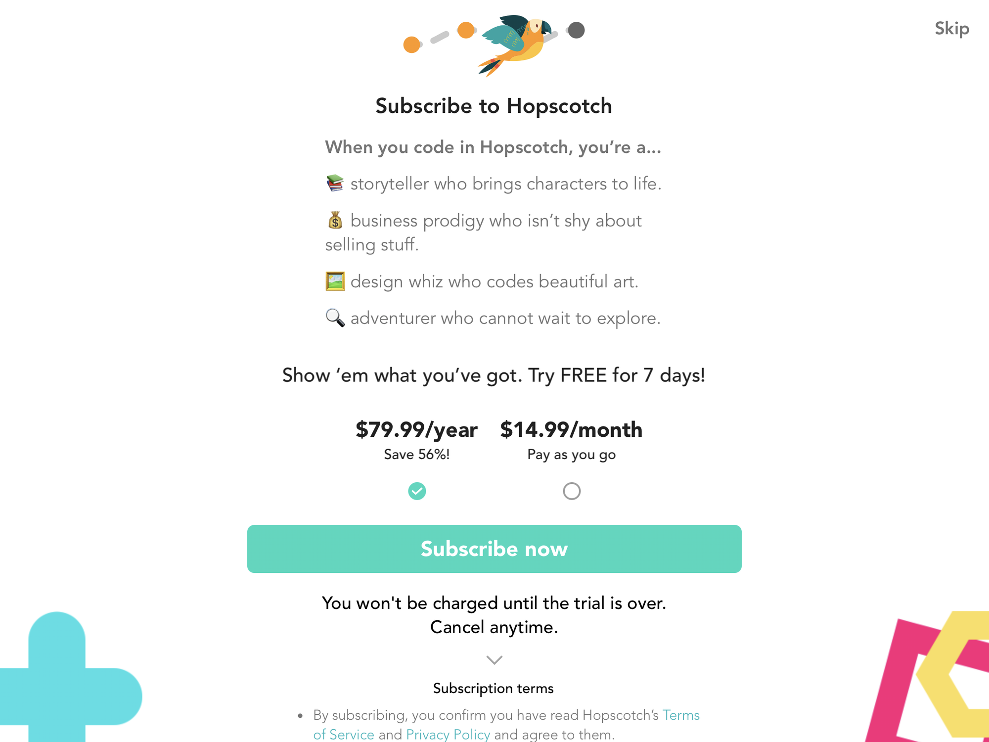
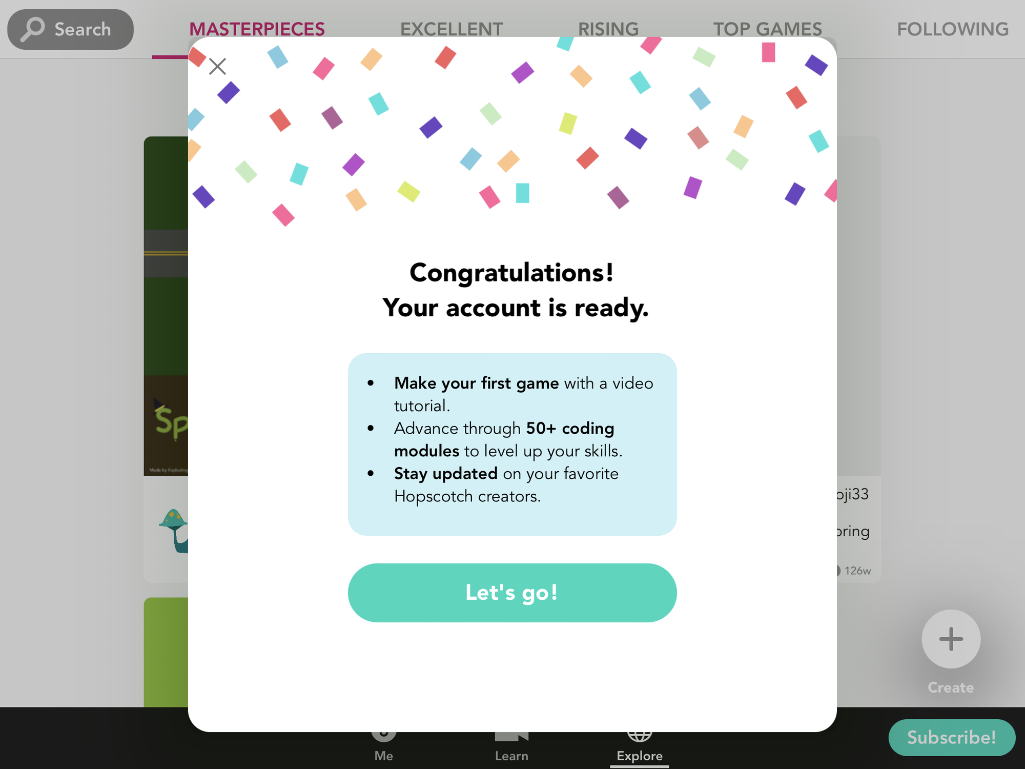
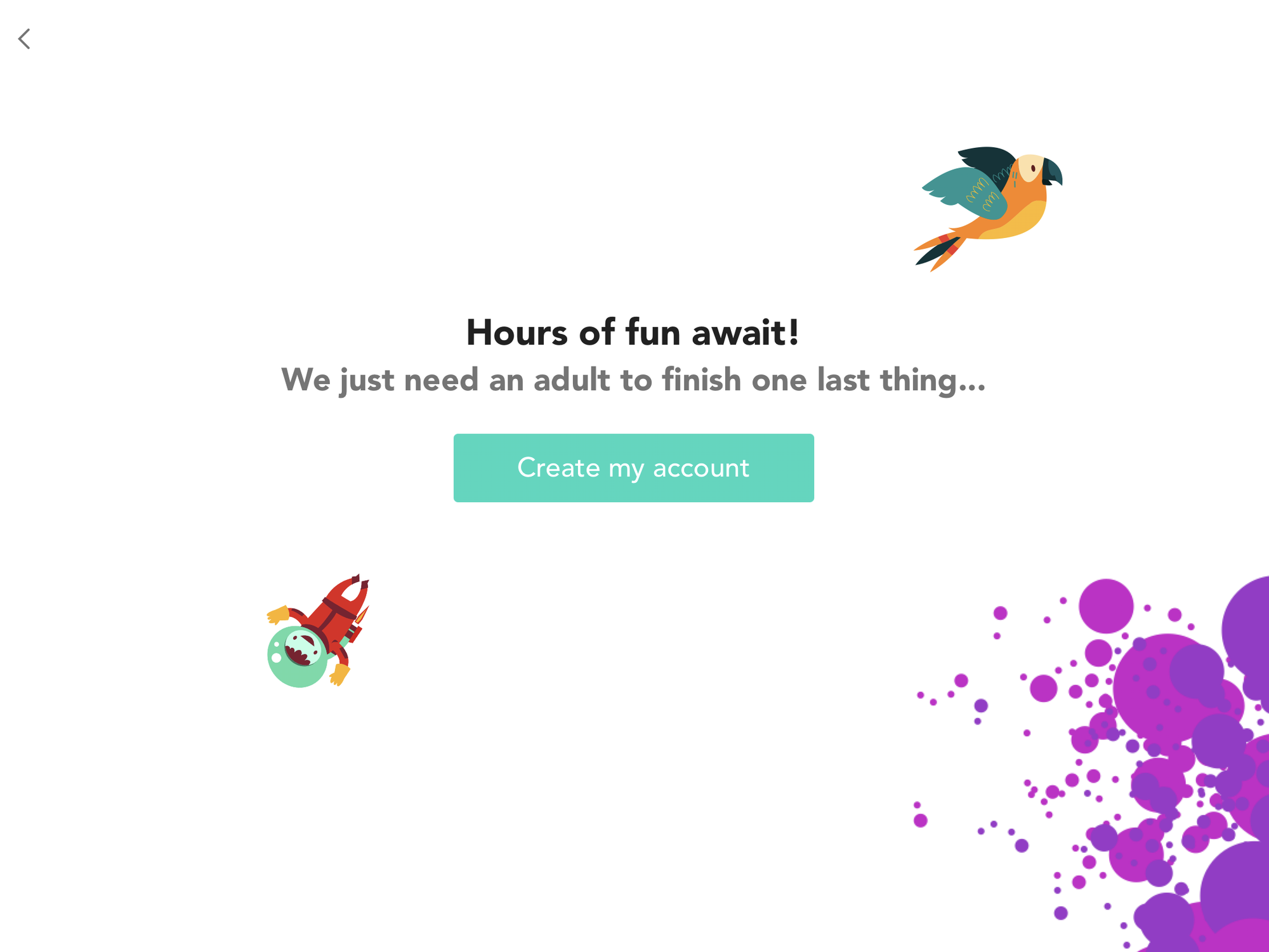
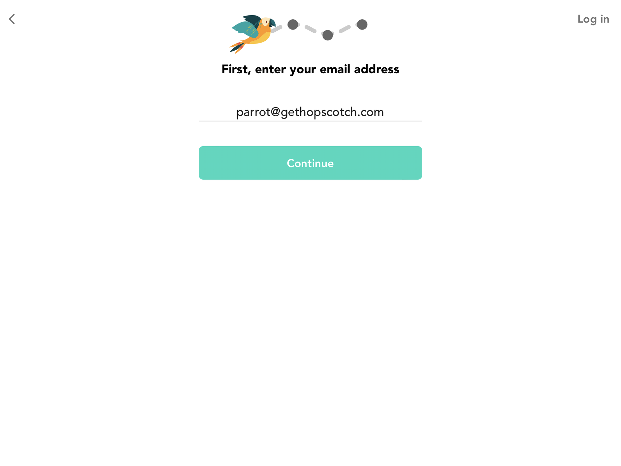
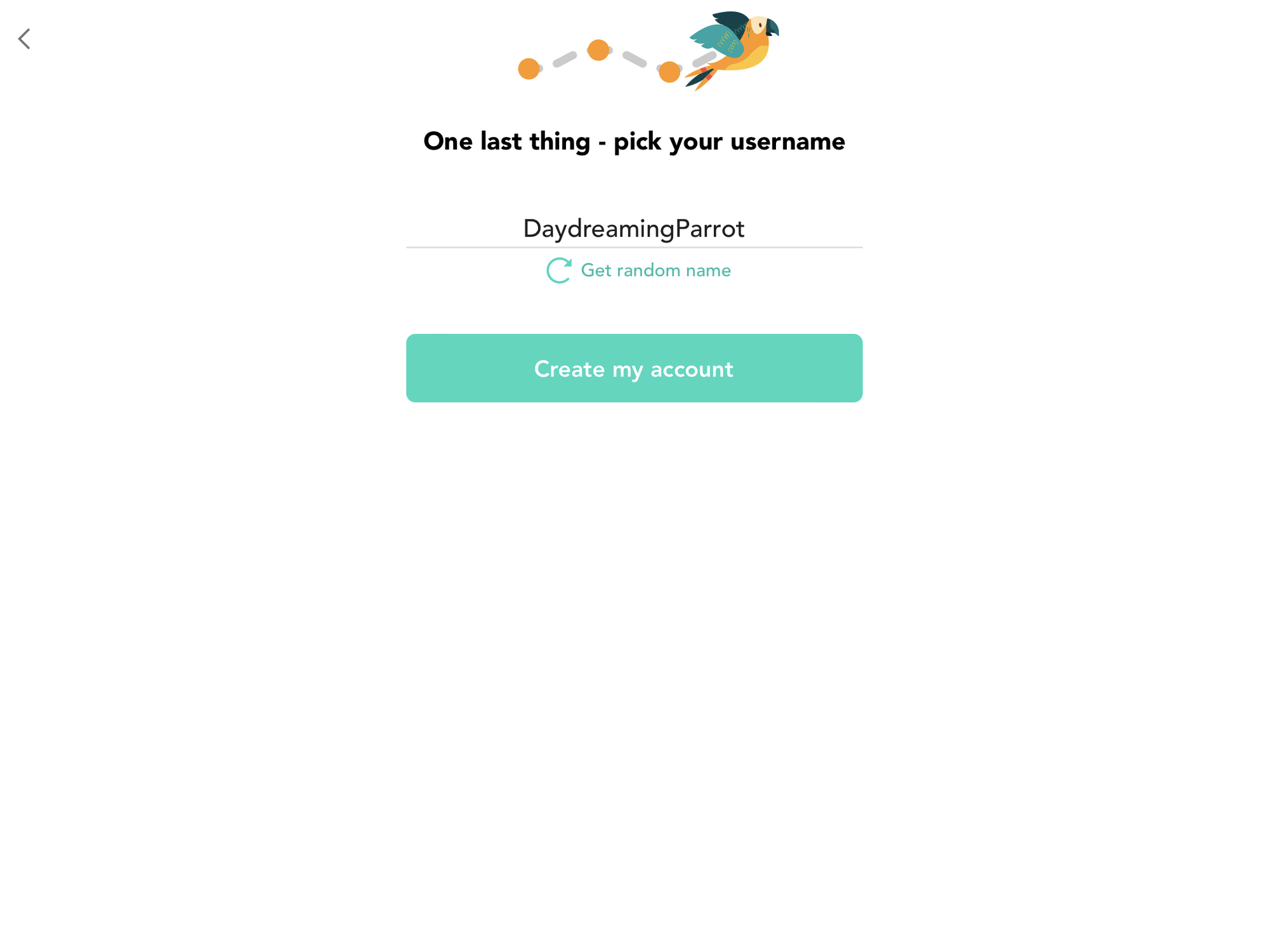
Onboarding Revamp
This onboarding change breaks up the form into multiple screens. I implemented a number of these screens as per our designs.
We used to have an onboarding screen which asked users to fill out email, password and username all on one screen. It turns out that each of these takes a while for users to figure out, and it's overwhelming and off-putting to have to do it all at once.
After this change, free-trials for our subscription went up by 20% compared to the control period.